SAT posters
Welcome and Transition Service
Job project

The Welcome and Transition Service (SAT) had no consistent visual language for its posters. They were disjointed and barely caught its audience’s attention, so fewer people used its services.
Brief and goal
A complete series of promotional posters to raise the visibility and engagement of the Welcome and Transition Service.
Role and responsibilities
Graphic design and visual identity.
Credits
Job project. The visual identity and the posters are my work.
Use of AI
I used ChatGPT’s image generation for the posters’ visuals, and Claude Code to add this sheet to the portfolio. My personal contribution includes the visual identity, the components in Figma, the posters, the social media graphics and the style guide.
Production steps
-
Step 1: Visual identity and style
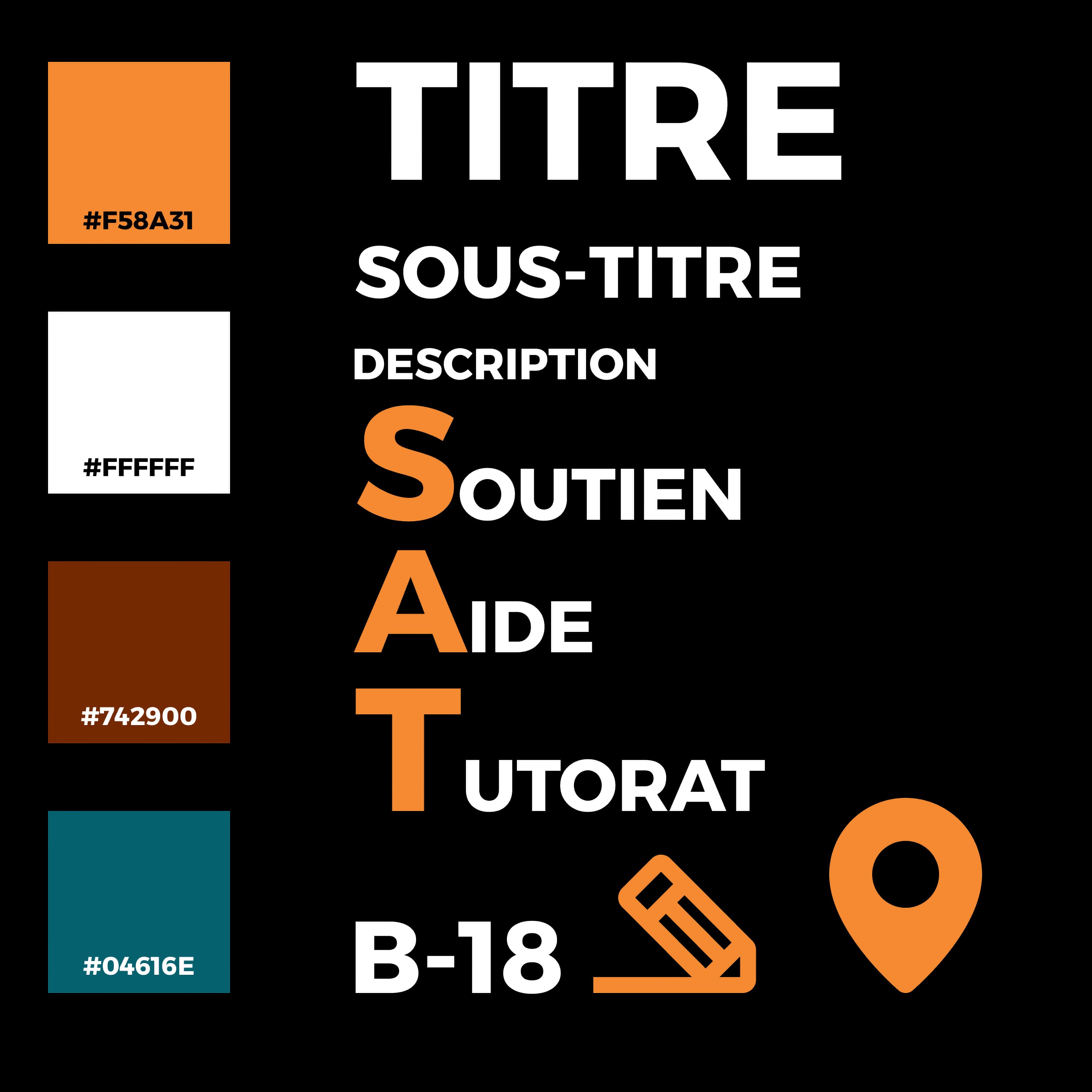
I drew on the few successful elements of the SAT’s former branding and modernized them. I chose a clear, highly legible type scale so the posters can be read from a distance.
-
Step 2: Component system
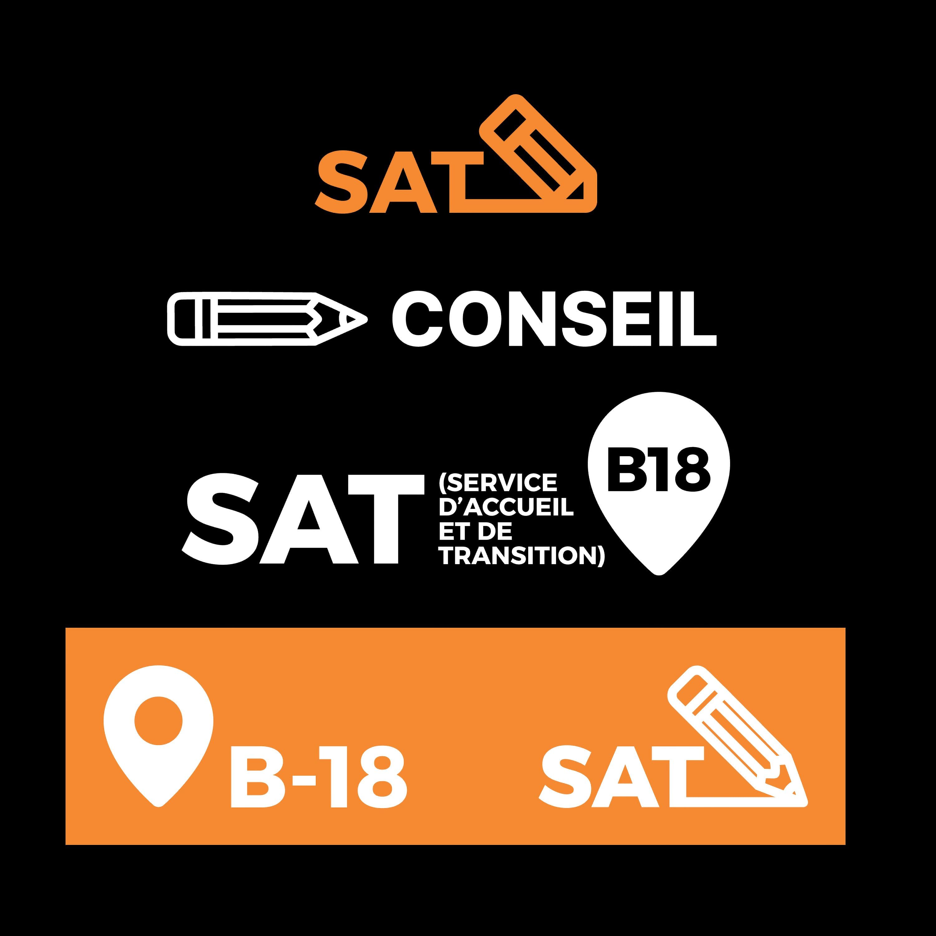
I built a component system in Figma to quickly try different poster layouts and social media formats, while following the brand’s rules.
-
Step 3: Grid and colours
A strict grid organizes the information to keep a professional tone, while dynamic graphic elements and contrasting colours add energy.

-
Step 4: Series of promotional posters
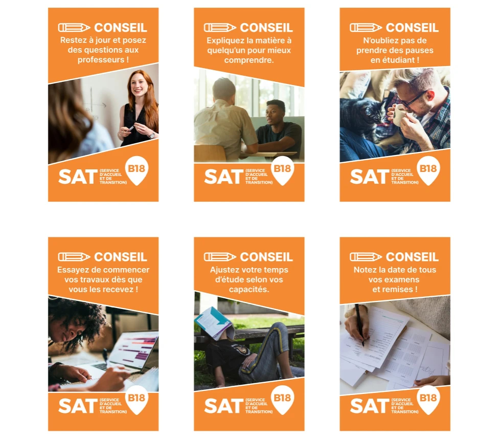
The system produced a series of print-ready promotional posters that stand out for their clear typography and consistent colours.

-
Step 5: Social media and style guide
The project also includes Instagram graphics, a brand style guide and a component library, so the client can keep using the system.
Technologies
-
Component system for the posters and social media formats.
-
Retouching the posters’ images.
-
Image generation for the posters’ visuals.
Challenges
Striking a balance between a professional institutional tone and a modern, approachable aesthetic that appeals to a younger audience.
Solutions
A unified visual identity, inspired by the SAT’s mission: a strict grid for information and contrasting colours so the posters stand out.
Final result
A system the SAT can keep using: print-ready posters, Instagram graphics, a style guide and a component library, approved and used across the campus.